Every token, rendered.
Every swatch, step and control below is painted by the stylesheet the rest of the site uses, so this page cannot describe a system the site does not have.
Signal-room console, softened.
#directionA night-shift operations room where one light is on. The canvas is near-black and tinted cold, the film carries the motion, one coral is reserved for action. Sora is set light and large; JetBrains Mono carries every label. Rounded controls float over one square film.
- A console with one light on.
- Near-black, cold-tinted surfaces and a single coral that always means do this.
- Two voices.
- Sora speaks, and JetBrains Mono labels and quotes the wire, so every transcript, command and label reads as machine output.
- Soft controls on a hard film.
- Pills and 24px cards float over a square, grainy stage.
- Quiet chrome, busy film.
- All the grit lives inside the video, and the page itself holds still.
- Honest content.
- Placeholders are labelled, prices are null until they are public, and every page has a Markdown twin.
Five of the do-nots, rendered
#do-notSection 12 of DESIGN.md is a list of sentences. Here each is two specimens, both built from the same tokens.
Do not use a second accent, a gradient on text, or coral as a background wash.
Do
Fixes
Patches, tests and opens the pull request.
Talk to usDo not
Fixes
Patches, tests and opens the pull request.
Talk to usAs a field, coral stops meaning do this.
Do not add shadows to cards, in either theme.
Do
A card
One hairline on surface, no shadow.
Do not
A card
The same card, lifted off the page.
Depth is the step from ground to surface to raised, plus one hairline.
Do not set headings above weight 500, and never bold for hierarchy.
Do
Every customer gets an engineer.
Sora 400 at the subhead step.
Do not
Every customer gets an engineer.
The same step at weight 700.
Hierarchy comes from size and space; the display step is the lightest thing on the page.
Do not set text under 13px, or body text under 16px.
Do
Expected output
Pairing request pr_01J8Q2 sent to jeevz-api.
Do not
Expected output
Pairing request pr_01J8Q2 sent to jeevz-api.
13px is the label floor; 16px is the phone body, under which iOS zooms a field.
Do not frost anything except the nav pill.
Do
A panel
Opaque surface, one hairline.
Do not
A panel
The same panel, frosted.
One glass surface is a signal; two are a texture.
Colour
#colourTwelve semantic tokens, resolved per theme at runtime. The live chip is painted from the custom property itself, so it has to match the printed value for the theme you are in. Flip the switch and watch which column it agrees with. Ratios are WCAG 2.2, computed here from the two hexes in the row.
| Token | Dark | Light | Live | Role | Contrast |
|---|---|---|---|---|---|
--ground | #08090B | #F4F3EF | page canvas | surface | |
--surface | #111317 | #E9E8E3 | cards, code, the wire panel | surface | |
--raised | #181A1F | #FBFAF7 | menu card, figure nodes | surface | |
--rule | #2A2D34 | #D3D2CC | 1px hairlines | surface | |
--ink | #F2F1EE | #0B0C0E | headings, body | 17.64 / 17.62 on ground | |
--graphite | #9A9DA6 | #5B5E66 | secondary text | 7.35 / 5.84 on ground | |
--accent | #FF5A47 | #C2331F | the one action colour | 6.46 / 4.99 on ground | |
--on-accent | #08090B | #FFFFFF | text on coral | 6.46 / 5.55 on accent | |
--accent-soft | #2A1512 | #F7DDD8 | selected choice, focus halo | 15.31 / 15.18 ink on it | |
--ok | #7FD39B | #1D6B3A | success line | 11.09 / 5.88 on ground | |
--bad | #FF9B9B | #A4262C | error line | 9.88 / 6.54 on ground | |
--nav | rgb(8 9 11 / 0.8) | rgb(244 243 239 / 0.88) | frosted nav pill (the one glass surface) | surface |
The stage, identical in both themes
#stage-palette| Token | Value | Live | Role | Worst pixel |
|---|---|---|---|---|
--color-stage | #0C0D10 | film ground and scrim colour | not text | |
--color-stage-ink | #F2F1EE | headline and nav text over the film | 12.08 | |
--color-stage-dim | #9A9DA6 | hero subhead | 7.12 | |
--color-stage-accent | #FF5A47 | hero primary button, nav CTA | not text |
Signal coral, the one accent
#coral-ramp- 50#FFE2D7
- 100#FFD1C3
- 200#FFB6A6
- 300#FF9280
- 400#FF715E
- 500#FF5A47
- 600#C2331F
- 700#9A3A2E
- 800#733026
- 900#4F251E
- 950#2D1916
--color-coral-50 to --color-coral-950
One ramp at OKLCH hue 29.8. Step 500 is the dark accent, 600 the light one, 300 the highlight over the film. No step lands in the audit's banned orange band.
The complement, the one other hue
#complementThree tokens at OKLCH hue 209.8, coral's opposite on the wheel (29.8 + 180). They mark a place and a phrase: a section wash, the 8px square in an eyebrow pill, and the marker block behind exactly one phrase of one heading, in at most one section per page. They are never an action colour: not a button, a link, a focus ring, a border on a control, a text colour or anything a pointer can act on. Coral remains the only action colour on the site. The pair is chosen per theme rather than inverted, so the marker is a deep block under light ink in the dark theme and a pale highlighter under dark ink in the light one.
| Token | Dark | Light | Live | Role | Contrast |
|---|---|---|---|---|---|
--complement | #66CFE1 | #097685 | the eyebrow swatch (never text, never an action) | 10.98 / 4.80 on ground, 9.90 / 4.37 on the wash | |
--complement-mark | #03545F | #88DDEC | the marker block behind one phrase of a heading | 7.63 / 12.67 ink on it | |
--complement-wash | #031A1D | #D6EDF1 | the peak of a section wash, fading to ground | 15.90 / 16.07 ink on it, 6.63 / 5.33 graphite on it |
Both marker pairs clear the 7:1 the site holds for display text. These ratios are computed from the mirror and rounded to the nearest hundredth, like every other figure on this page; DESIGN.md's own complement table rounds the same measurements down, so six of them read one hundredth lower there.
Typography
#typographyA major third (1.25) on an 18px body, each step rounded to the 4px grid: 18, 24, 28, 44, 56, 68. The mono label holds a 13px floor. Tracking and leading tighten as size grows. Each specimen is set by the class named beside it.
Every customer gets an engineer.
--text-display
.type-display 68px / 40px, 400, 1.05, -0.02em. the home h1 and the statement under it.
Every customer gets an engineer.
--text-page
.type-page 56px / 32px, 400, 1.06, -0.03em. every other page's h1.
Every customer gets an engineer.
--text-heading
.type-heading 44px / 32px, 400, 1.1, -0.025em. section h2.
Every customer gets an engineer.
--text-subhead
.type-subhead 28px / 28px, 400, 1.2, -0.02em. tier names, phone menu links.
Every customer gets an engineer.
--text-title
.type-title 24px / 24px, 500, 1.25, -0.015em. card h3, doc steps, the form card.
Every customer gets an engineer.
--text-lede
.type-lede 24px / 18px, 300, 1.45, -0.01em. page ledes, section subs.
Every customer gets an engineer.
--text-body
.type-body 18px / 16px, 400, 1.6, -0.005em. prose, the hero subhead.
Every customer gets an engineer.
--text-small
.type-small 16px / 16px, 400, 1.6, -0.005em. phone body, inputs, table cells.
Every customer gets an engineer
--text-label
.type-label 13px / 13px, 500, 1.4, 0.12em. nav links, crumbs, code labels, chips.
The prose measure
#measureA customer's agent files a reproduction over a standing Knock pairing, and the vendor's engineer reproduces it, patches it and opens a pull request that a human merges. Prose never runs wider than this, about seventy characters at the body step.
--container-text
40rem caps prose, --container-lede 36rem the hero subhead, --container-prose 96rem the page.
The mono face
#monoJetBrains Mono, the label and code face
knock pair request jeevz-api --as fleet/build
Pairing request pr_01J8Q2 sent to jeevz-api
The metric-matched fallbacks
#fallbacksBoth faces are self-hosted at font-display: swap, with the local fallbacks overridden to their metrics, so the swap moves nothing: the audit holds layout shift under 0.01 with the fonts held back 1.5s. Sora falls back to Arial at size-adjust 113.02% (106.65% above weight 600); JetBrains Mono falls back to Courier New at 100%, ascent 102%, descent 30%.
Spacing and rhythm
#spacingThe base is --spacing: 0.25rem, four pixels, and every padding, gap and size is a multiple of it. The bars below are drawn at true size with calc(n * var(--spacing)), so they measure the token rather than a number copied from it.
- 1 x 4 = 4px
- 2 x 4 = 8px
- 3 x 4 = 12px
- 4 x 4 = 16px
- 6 x 4 = 24px
- 8 x 4 = 32px
- 12 x 4 = 48px
- 16 x 4 = 64px
- 24 x 4 = 96px
- 32 x 4 = 128px
- 40 x 4 = 160px
One edge
#one-edgeThe nav pill's outer edges, the hero headline, the subhead, the buttons and every section hang on the same two vertical lines: max(var(--gutter-phone), var(--gutter-edge)), a floor of 1rem and 3.75vw above it.
| Viewport | Gutter | From |
|---|---|---|
| 390px | 16px | --gutter-phone 1rem |
| 768px | 29px | --gutter-edge 3.75vw |
| 1024px | 38px | --gutter-edge 3.75vw |
| 1440px | 54px | --gutter-edge 3.75vw |
Section rhythm
#rhythm| Token | Value | Applies |
|---|---|---|
--space-section-phone | 5rem / 80px | under 48rem |
--space-section-tablet | 6rem / 96px | 48rem and up |
--space-section-desktop | 8rem / 128px | 64rem and up |
--space-section-wide | 10rem / 160px | 90rem and up |
Radii
#radiiSoft interface over a linear stage. Each tile is a 96px square with one radius token applied; the film and its scrim are the only square things left.
--radius-pill
9999px
the nav pill, nav links and CTA, buttons, switches, chips, radio choices
--radius-lg
24px
cards, the wire panel, the pairing figure, table wrappers, the phone menu card
--radius-md
16px
inputs and textareas, code blocks, figure nodes, the pairing output
--radius-sm
8px
inline code
--radius-none
0px
the hero film and its scrim, and nothing else
Elevation and depth
#elevationNo shadows on cards, in either theme. A card is a hairline on surface, and depth is the step from ground to surface to raised. There is exactly one glass surface: the nav pill above this page.
--ground, --surface, --raised
Three steps and one hairline carry every layer the page has.
--accent, --accent-soft
A 2px accent outline at a 3px offset; fields add a 3px accent-soft halo. Both are drawn by the stylesheet's own :focus-visible declarations.
The scrim is a gradient, never a panel
#scrimMotion
#motionNothing animates at load. Three exemptions are named below: two run on scroll position rather than time, and the third is timed but runs only while it is on screen. The film is the motion. Press Replay to run a token once, again to run it back. Under prefers-reduced-motion: reduce every transition drops to 0s, so each dot jumps to its end and the specimen is a static frame.
--duration-fast
150ms on --ease-out. field borders, the switch knob.
--duration-base
300ms on --ease-out. button and nav-link fills.
--duration-slow
450ms on --ease-out. the nav CTA's fill, and the header pill's width morph.
--ease-out
cubic-bezier(0.2, 0, 0, 1) over 450ms. every interaction.
--ease-in-out
cubic-bezier(0.4, 0, 0.2, 1) over 450ms. reserved, unused today.
--ease-morph
cubic-bezier(0.34, 1.2, 0.5, 1) over 450ms. the header pill's scroll morph only (a slight overshoot).
The three named motion exemptions
#exemptionsThe rule is that nothing on the page animates at load. There are exactly three exceptions, each named, each paint only, and each held by its own check in scripts/audit.mjs. The at-load animation count is not relaxed for any of them, so anything that runs at load fails web.dev rule 4, agent-first 6 and its own check at once. Under prefers-reduced-motion: reduce the film holds its poster, the statement renders finished, and the loop's schematics stay in the state they load in.
| Name | Animates | Gated by | Proved by |
|---|---|---|---|
floating-nav | The header pill's morph: the pill surface scales, the brand and the links translate, the links fade. Transforms and opacity only, so no box moves. | Scroll position, never time. The classes are set only from script once a person scrolls, and undone at the top. | The floating-nav extra: no fixed or sticky layer at load, then only the header and its progress line, no layout shift, all undone at the top. README rule 7. |
statement-ink | The statement under the hero: its words come up from graphite to ink one at a time. Colour only, so nothing moves. | Scroll position, never time: a view timeline over the sentence, animating the one registered property --statement-p. | The at-load animation count, which exempts exactly that animation on #statement > .statement-text and fails any other, plus rule 4's layout-shift scan down every page. |
loop-motion | The loop's five schematics: one coral tracer each on a fixed path, and one small state change as it lands. Stroke dash offset, colour and opacity, paint only. | Time, a 3s linear cycle, but only while the list is scrolled into view: components/loop-motion.tsx classes it is-live past a tenth of the viewport and unclasses it when it leaves. Never at load, never under reduced motion. | The loop-motion extra: at load nothing in #loop animates; in view five tracers run inside the aria-hidden drawings, paint only, no layout shift; out of view they stop; reduced motion never starts them. |
Iconography
#iconographyNo icon set, because type is the design. Five glyphs exist and all five are drawn in CSS from tokens. If icons are ever needed: one monochrome set, sized to the adjacent line height.
.mark, .knob
A 16px ring with a coral dot, and the theme toggle's switch knob. The 6px coral bullet and the 13px step node are drawn by the tier list and loop rail below; the two-line Menu glyph exists only under 64rem.
Components
#componentsEvery control below is the site's own markup and classes. The state specimens are non-interactive on purpose: they take the same declarations the live buttons do, so all of them read at once.
Buttons
#buttons.btn
A coral pill, 44px high (48px on phone), Sora 500 at 15px, 0 24px padding. Hover fills with ink over 300ms, active drops to graphite, focus is the accent outline. Disabled is opacity: 0.6 with a progress cursor and is described rather than drawn: a specimen that only looks disabled is not exempt from the contrast rule, and a really disabled control is neither fully opaque (rule 7) nor pointer-cursored (rule 3).
.btn.ghost
The same pill, transparent, with a rule hairline and ink label. Hover fills with surface. Active is missing on purpose: .btn:active fills graphite for both kinds, leaving an ink label at about 1.9 to 1 here, and DESIGN.md's Secondary column leaves Active blank.
.actions
The live pair, in the row the site ships. On phone they stack full width, 12px gap.
The nav pill
#nav-pillThe header above this page is the specimen: 16px from the top, full width between the gutter lines, 56px minimum height, on --nav behind a 20px blur. Links are mono 13px uppercase in 40px pills that fill with ink on hover and focus. Scroll and it floats at 896px, compacts to 352px going down, expands going up, all with transforms so no box moves. It is the one layer allowed to stick, and only after a scroll.
Inputs and chips
#fieldsinput, --radius-md
48px minimum height, 12px by 16px padding, mono 16px so iOS never zooms, a graphite hairline on ground, 16px radius. The label sits above, linked with for.
.link, .choice
Mono 13px in a 28px pill, 0 12px padding. The pairing chip takes a dashed accent hairline; a radio choice is a 48px pill filling accent-soft when checked.
Cards
#cardsKnows
Reproduces and triages every report.
- One coral bullet, 6px
- Body text in graphite
Fixes
The featured tier swaps its hairline to accent.
- Same card, accent border
- No shadow, either way
.tier, --radius-lg
24px radius, one rule hairline, surface fill, no shadow. Padding 2rem, 1.25rem on phone, 3rem on the closing card. Body text inside a card is graphite.
The loop rail
#the-loopDetect
The first node is filled coral: the current step.
Knock
The rest are 13px rings on a 1px rule.
Triage
Five steps at desktop, two at tablet, one on phone.
.loop
The 13px step node, the third CSS glyph. Under 64rem the rail goes and each step takes a top hairline.
The ledger
#ledgerThe loop's five schematics
#schematics- Detect
- Knock
- Triage
- Fix
- Verify
.loop-art, .lp-tracer
One fixed line drawing above each step of #loop, in a 200 by 120 viewBox at most 15rem wide: graphite rules at 0.35 opacity, ink for what is live, accent for the case itself and for the tracer. No text inside (the step's own h3 is the label), aria-hidden, no pointer events. Shown here at rest, which is the finished state the server sends; the tracers only move on the home page, and only while that list is on screen.
The three tier icons
#tier-icons.tier-icon, .ti-dim, .ti-dash
One monoline drawing per tier in the scale treatment on #pricing, drawn by hand rather than taken from a set, because each has to mean its tier. Line work only: a 1.5px stroke at every size (vector-effect: non-scaling-stroke), round caps, no fills, ink and graphite and no other colour, 128px on desktop and 96px under 64rem. Ink is the engineer's own work, graphite is what it works on, and a dashed stroke is what stays outside its authority: the report as filed, the way back to main that a human merges, and the cap a reversal turns inside. Like the ledger they carry no text and are aria-hidden.
The hero
#heroFour pieces above the fold: the film, the headline, the subhead, two buttons. The film is a 21 second, six scene video, muted and looping, full bleed, square cornered, object-fit cover. It is aria-hidden decoration with no pause control, holds its poster under reduced motion, and is the one documented exemption to the 80 KB per page budget.
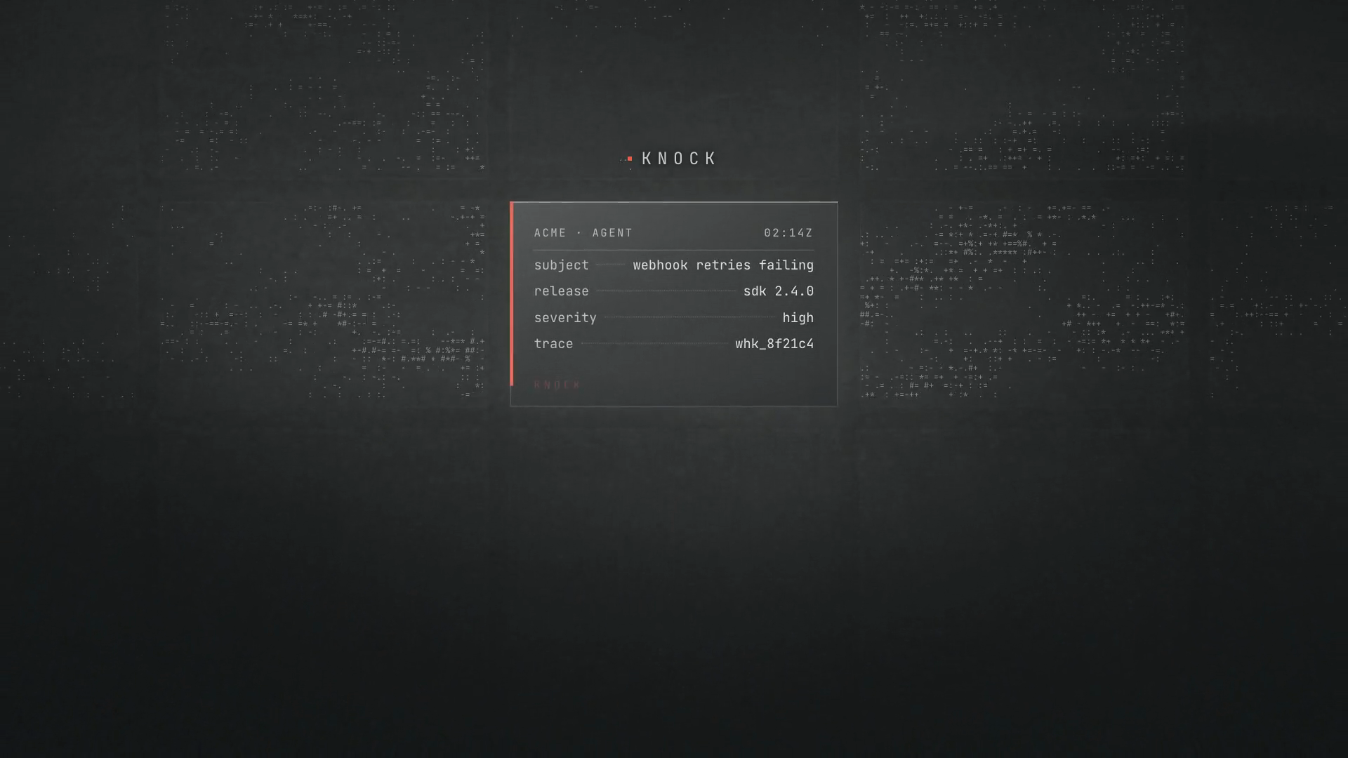
/assets/hero/stage-poster.png, at 1440 by 810. The six scene frames live in research/next-landing/hero/ and are not served, so what they prove is served instead: the numbers below.Six scenes, measured on the worst pixel
#scenesLegibility comes from the scrim alone, proved per scene rather than per theme. scripts/renders.mjs photographs each scene with the copy made transparent and measures against the brightest pixel behind each text box. The stage is identical in both themes.
| Scene | At | Headline | Highlight | Subhead |
|---|---|---|---|---|
| Scene 1 | 1.75s | 14.08 | 8.25 | 7.12 |
| Scene 2 | 5.25s | 15.05 | 8.49 | 6.91 |
| Scene 3 | 8.75s | 13.75 | 8.56 | 7.12 |
| Scene 4 | 12.25s | 14.29 | 8.33 | 6.85 |
| Scene 5 | 15.75s | 16.02 | 8.35 | 7.12 |
| Scene 6 | 19.25s | 14.25 | 7.42 | 7.12 |
Sora 300 at 68px in two balanced lines, bottom left on the gutter line. The highlight, "an engineer.", is coral-300 text with no block behind it. The subhead is stage-dim at the body step, at most 36rem wide, 1.25rem under the headline. Buttons sit bottom right on the subhead's row, stacked full width on phone.
Using this system
#usageA token lives in three files at once and the build refuses to let them disagree. To add or change one, edit all three in the same commit: the @theme block or the two theme blocks in app/globals.css, the entry in lib/tokens.ts, and the table in DESIGN.md that names the value. scripts/tokens-check.mjs compares all three and also fails if DESIGN.md never names a value the stylesheet declares.
Add a token, then prove it
# 1. app/globals.css   the value the site renders
# 2. lib/tokens.ts     the TypeScript mirror
# 3. DESIGN.md         the spec that names it
node scripts/tokens-check.mjs
npx next build && node scripts/twins.mjs
node scripts/audit.mjs
The spec itself is DESIGN.md at the repository root, written in the Refero DESIGN.md shape; this page is its rendering. The machine-readable copy of this page is its Markdown twin at /brand/index.md, generated by scripts/twins.mjs from the served HTML and never edited by hand. The route carries robots: noindex and no navigation links to it.